Understanding the Color Wheel
The color wheel is a circular diagram showing color relationships, with primary colors (red, yellow, blue) forming the base. Mixing these creates secondary and tertiary colors, which are essential for designing a color mixing chart. This tool helps visualize how colors interact and blend, aiding in precise color combinations for artistic and design projects.
Primary, Secondary, and Tertiary Colors
Primary colors—red, yellow, and blue—are the foundation of the color wheel and cannot be created by mixing other colors. Secondary colors, such as orange, green, and purple, are formed by mixing two primary colors. Tertiary colors, like yellow-green or blue-violet, are created by blending a primary and a secondary color. These color categories are essential for building a comprehensive color mixing chart, as they form the basis for understanding how colors interact and blend. By experimenting with these colors, artists and designers can create a wide range of hues and shades, enabling them to produce harmonious and balanced palettes for various projects. This knowledge is crucial for mastering color theory and effectively using a color mixing chart to achieve desired results.
The Role of Hue, Saturation, and Value in Color Mixing
Hue refers to the actual color itself, such as red, blue, or yellow. Saturation describes the intensity or purity of a color, with higher saturation meaning a more vibrant hue. Value indicates the lightness or darkness of a color, ranging from black to white. Together, these elements are fundamental in color mixing. Adjusting saturation can make colors appear more or less vivid, while altering value changes their brightness. Understanding these properties is key to creating balanced and harmonious color palettes. A color mixing chart helps visualize how these elements interact, allowing artists to predict and achieve desired shades and tones. By manipulating hue, saturation, and value, creators can craft a wide range of colors for various artistic and design applications.
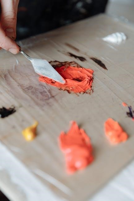
Creating a Color Mixing Chart
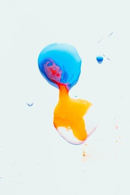
A color mixing chart is a visual tool that organizes colors and their combinations, helping artists and designers understand how to mix hues effectively.
How to Design a Custom Color Mixing Chart
Designing a custom color mixing chart begins with selecting your base colors, such as primary colors or specific hues from your art supplies. Arrange these colors in a grid or circular layout to visualize their relationships. Start by placing primary colors at the center or top, then create secondary and tertiary colors by mixing them in varying proportions. Include tints (adding white), tones (adding gray), and shades (adding black) to show how colors shift in brightness and saturation. Use a downloadable PDF template or create your own using software for precision. This chart helps artists and designers experiment with color combinations, ensuring consistency and creativity. Print it on high-quality paper for easy reference during painting or design projects. A custom chart is invaluable for mastering color theory and achieving precise results.
Understanding Color Ratios and Proportions
Color ratios and proportions are fundamental to creating a color mixing chart. By mixing primary colors in equal parts, you can produce secondary colors like green, orange, and purple. Varying the proportions of these colors allows you to create tertiary colors, adding depth and variety to your palette. For example, mixing two parts of one primary color with one part of another yields unique shades. Understanding these ratios helps in designing a custom chart, ensuring consistency in color combinations. You can also experiment with tints (adding white) and shades (adding black) to explore lighter and darker variations. This knowledge is essential for artists and designers, as it enables precise control over color outcomes. Use a PDF template or digital tool to test and visualize these ratios effectively.
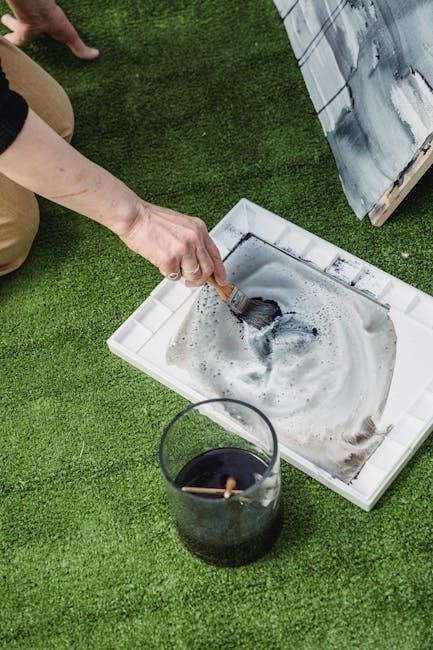
Practical Applications of a Color Mixing Chart
A color mixing chart is invaluable for painting and art projects, offering a visual guide to achieve desired hues and shades, perfect for artists and educators.
Using the Chart for Painting and Art Projects
A color mixing chart is an essential tool for artists, providing a visual guide to create custom hues and shades. By referencing the chart, painters can mix primary colors to achieve secondary and tertiary colors, ensuring consistency in their work. This helps in experimenting with unique color combinations and understanding how different ratios of pigments affect the final result. For art projects, the chart simplifies the process of matching colors, reducing waste and saving time. It also aids in maintaining color harmony and balance, which are crucial for creating visually appealing compositions. Many artists print a color mixing chart PDF to have a handy reference, making it easier to plan and execute their creative visions effectively.
Importance of Saturation and Complementary Colors
Saturation and complementary colors play a vital role in color mixing, as they influence the vibrancy and harmony of hues. Saturation refers to the intensity or purity of a color, with higher saturation meaning a more vivid tone, while lower saturation results in a muted or grayish appearance. Complementary colors, which are pairs of colors opposite each other on the color wheel, can be used to reduce saturation when mixed. For example, adding a complementary color to a vibrant hue creates a more subdued tone. A color mixing chart PDF often highlights these relationships, making it easier to experiment with saturation levels and complementary color combinations. This knowledge is especially useful for achieving balanced palettes and creating visually appealing designs in art and design projects.
Advanced Color Mixing Techniques
Advanced techniques involve exploring triadic color schemes and mixing colors in equal parts for balanced palettes. These methods enhance color harmony and create vibrant, nuanced hues effectively.
Exploring Triadic Color Schemes
A triadic color scheme involves three colors equally spaced on the color wheel, creating a vibrant and balanced palette. This method is ideal for artists seeking bold contrasts and dynamic compositions. By selecting colors like blue, yellow, and red, you can achieve a harmonious yet energetic visual effect. A color mixing chart PDF can guide you in mixing these colors accurately. For instance, mixing equal parts of blue and yellow produces green, which can then be combined with red for unique shades. This technique is perfect for creating eye-catching artwork and ensuring color consistency in your projects. It also allows for endless experimentation, making it a favorite among both beginners and experienced artists alike.
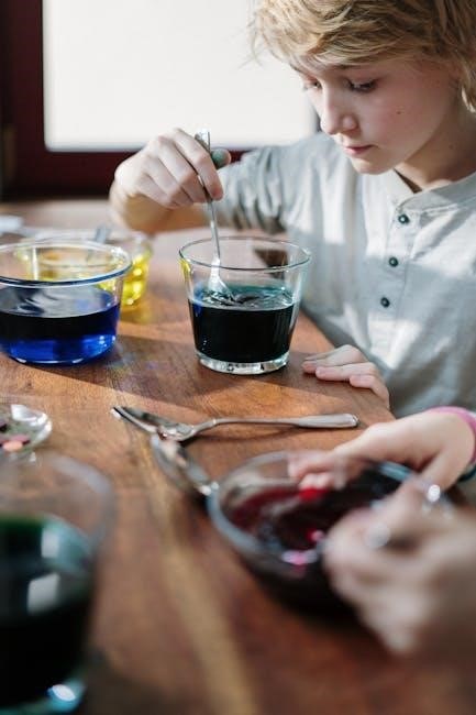
Mixing Colors in Equal Parts for Balanced Palettes
Mixing colors in equal parts is a foundational technique for creating balanced and harmonious palettes. By combining primary colors like red, blue, and yellow in equal proportions, you can achieve a neutral base, such as black or gray, which can then be adjusted for tone and saturation. This method is particularly useful for artists and designers aiming to create cohesive color schemes. A color mixing chart PDF can serve as a valuable guide, illustrating how equal parts of different colors interact and blend. For example, mixing equal amounts of red and blue produces purple, while equal parts of blue and yellow result in green. This approach ensures consistency and predictability, making it easier to achieve the desired hues for your projects. It also encourages experimentation, allowing you to explore a wide range of creative possibilities.
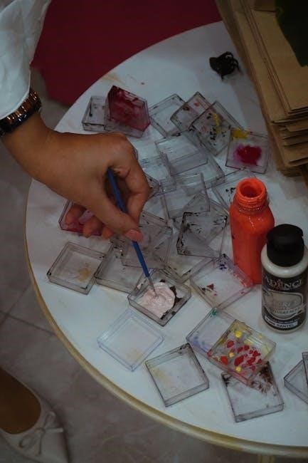
Digital Tools and Resources
Digital tools like downloadable color mixing chart PDFs and color matching apps offer precise color combinations and organized palettes. These resources simplify the mixing process for artists and designers.
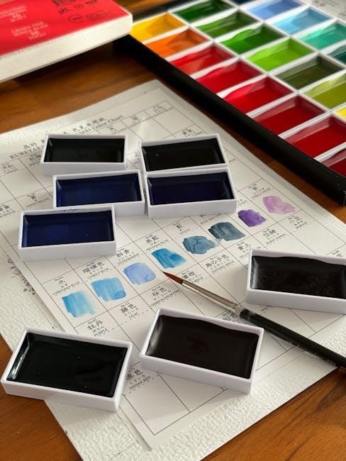
Downloadable Color Mixing Chart PDFs
Downloadable color mixing chart PDFs are versatile tools for artists and designers, offering pre-designed templates to explore color combinations. These charts are available in various sizes, such as half-letter or A4, making them easy to print and use. Many PDFs are customizable, allowing users to fill in color swatches based on their specific paints or markers. They provide a structured way to visualize how primary colors mix to create secondary and tertiary hues. Artists can use these charts to experiment with ratios and proportions, ensuring consistent results. Additionally, they serve as excellent teaching aids for beginners learning color theory. Laminating the charts makes them reusable, and they can be referenced for painting, drawing, or digital design projects. Overall, downloadable PDFs are practical resources for mastering color mixing and creating harmonious palettes.
Using Color Matching Apps for Precision
Color matching apps have revolutionized the way artists and designers approach color mixing, offering unparalleled precision and convenience. These apps allow users to explore color libraries, calculate exact mix ratios, and identify complementary hues effortlessly. By inputting desired colors, the apps provide detailed formulas for achieving specific shades, eliminating guesswork. Many apps also support importing and exporting color palettes, making collaboration and project planning seamless. Additionally, some apps generate custom color mixing charts in PDF format, which can be printed for quick reference. This integration of technology with traditional color theory ensures accurate and efficient results, whether for painting, digital design, or any creative endeavor. With real-time adjustments and instant feedback, color matching apps are indispensable tools for modern creators.